Email best practices
Effectively use newsletter graphics with these 6 tips
Without graphics, newsletters just look as dull as legal documents. Add some pizzazz to your newsletter design with this selection of graphical elements.
PUBLISHED ON
Newsletters don’t have to be boring like a broadsheet newspaper. They can be fun like the colorful, moving newspapers from Harry Potter.
With the advent of useful design software like Canva and Figma, it’s never been easier to spruce up your newsletters with engaging graphics.
Let’s look at some of our favorite examples of newsletter examples from leading brands.
Table of contents
1. Use infographics
2. Play with colors
3. Use hand-drawn graphics
4. Add motion
5. Emphasize a theme
6. A/B test
Table of contents
01Six tips to effectively use graphics in newsletters
Six tips to effectively use graphics in newsletters
There are many ways to use graphics in newsletters without the need for an art school scholarship. Let’s run through some examples of where graphics have boosted the design of newsletters.
1. Use infographics
Infographics communicate data to your customers in an easy-to-understand, visually appealing package. Rather than poring through tedious figures and struggling to process information, audiences can grasp and enjoy the content.
To create a helpful infographic, first, you'll want to identify your infographic's specific market and intent. Then, you'll need to gather the relevant data you'd like to communicate to your customers. With this, create an infographic that captures your audience's attention by relaying information in an attractive, logical, and enjoyable fashion.
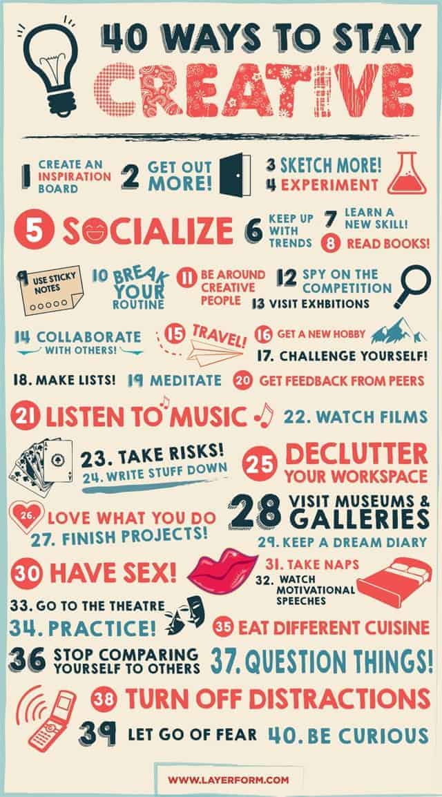
Even listicles look good in infographic format.
2. Play with colors
Experimenting with the color scheme in your newsletter gives you a way to convey different moods and evoke an emotional response from your audience. Tools at your disposal include various hues of the color palette, gradients, color blocking, and the overall layout. You can also test different text shades and see how they relate to the surrounding images to help get your message across. Colors allow you to create and express your vision for your brand.
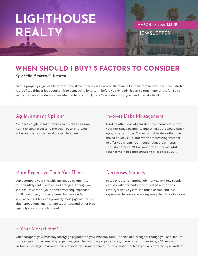
Vengage’s purple newsletter is easily recognizable.
3. Use hand-drawn graphics
Hand-drawn graphics add a personal, human touch to the design elements of your company newsletters. Adding hand-drawn highlights to your newsletter can change the design's whole mood and make it more inviting and personable. Some options include drawing pictures, underlining information, using arrows, or writing stylized text.
Hand-drawn graphics can convey your brand's unique personality, further increasing customer appeal. To create hand-drawn illustrations, you have several tools at your disposal, like a digital stylus, Canva, InDesign, or old-fashioned pencil and paper that you can scan and digitize.

Coach’s hand-drawn newsletter leads the eye to the next product.
4. Add motion
Adding motion to visual elements in your email campaigns enlivens the tone and grasps your readers’ attention, encouraging them to learn more in a lighthearted fashion. Positioning an animated GIF at the center of the newsletter on a neutral background attracts the attention of your target audience. Toss in your essential information and an adjacent CTA to increase your conversion rates.
Animation is cool and increasingly easy to create.
5. Emphasize a theme
A clearly defined theme in your business newsletter emails can set it apart from the pack. Unlike something bland and inconstant, a strong theme generates customer interest, curiosity, and further communicates your brand's identity. The theme can also tie into the unique subject of the newsletter, using visual cues to convey information.

Serumize’s newsletter uses a unique combination of dark green and light pink.
6. A/B test
An effective email newsletter design attracts new customers and helps your brand to succeed. It’s important to know if one newsletter design performs better than another, which you can do by completing an A/B test.
With an A/B test, you send out one newsletter version to a specific audience segment and another to a different group. Then, after compiling the results, you send the newsletter with the highest click-through rate (CTR) to a third group. This method eliminates the guesswork in designing an effective newsletter.
The don’ts of newsletter graphics
Overload: While visual content and graphics are a valuable part of an effective newsletter layout, too much can make your audience turn away. Recipients of your newsletter might have images blocked or a poor internet connection, making your newsletter unreadable or slow to load. And too many generic graphics can dilute your brand identity, appearing unexciting and not capturing the reader's interest.
Use low-quality graphics: Low-quality graphics can lessen the appeal of your newsletter layout, resulting in negative brand perception and lower CTRs. Low quality pictures could create negative messages about your brand, like poor product quality, lack of expertise, and an indifferent tone.
Background images:Many email programs don't initially load images by default. Using a background image as a part of your email graphics can create a problem with the reader viewing pertinent information. You can avoid this issue by choosing a text color without a loaded background image. Or don’t use one at all.
Create visually appealing newsletters with Mailjet
Well-designed email newsletters with appealing visual content can increase your customer base and improve CTRs. But when you have several responsibilities, producing professional-looking email newsletters may be challenging.
Luckily, Mailjet makes creating unique and colorful newsletters easy. For design ideas, Mailjet's professional newsletter templates provide a polished, expert look to all of your communications. And they allow customization to fit the needs of your specific brand. Your email list recipients will notice and appreciate the consistent vibe.
Or, you can create your design templates using our drag-and-drop Email Editor to add content, calls-to-action (CTAs), and images for a unique look.
