For email marketers, the holiday season is arguably the most important on the calendar. From festive promotions to themed content, there are countless ways for brands to capture consumer attention. So, it’s time to start putting together amazing holiday email marketing campaigns that will help us to embrace the holiday feeling to build our brand and drive sales. And, as usual, Sinch Mailjet’s here to help you with that. So, sit back, relax and get ready to hit the email jackpot!
We’ve combined all our Holiday resources in one, to create your one-stop shop to win the battle of the inbox this season. In this ultimate guide to holiday emailing, you will learn how to create amazing content for your campaigns, you’ll find great design tips from some of our friends in the industry and get inspired by great email examples from top brands.
Chapter 01
What are the benefits of holiday email marketing?
Email marketing is a proven technique to reach customers, foster growth, and maintain a strong relationship with existing users. It’s the first marketing channel for ROI year around, but especially effective during the holiday season.
Why? Well, holiday email marketing offers several benefits for both businesses and marketers. Here’s just a few for you to consider.
Increase sales
By promoting special offers, discounts, coupons, and holiday-themed products or services, you can capitalize on the heightened consumer spending that often accompanies holidays.
This is especially true for Black Friday and Cyber Monday, when customers expect to receive emails from brands with their offers and discounts.
Customer engagement
Holiday emails allow you to engage with your audience in a more festive and personalized way. You can create themed content and connect with your subscribers on a more emotional level, strengthening customer relationships.
Reactivate cold leads
Let’s face it, we’ve all got contacts lying dormant in our email lists. Holiday email marketing campaigns give you the perfect excuse to get back in touch, since everyone’s expecting some sort of offer over the holiday season. This could provide you with a quick seasonal boost in sales.
However, reaching out to contacts you haven’t connected with in a long period of time could have a negative impact on your email deliverability. Make sure you’re following our email deliverability advice to protect your holiday email sends.
Foster loyalty
Holiday emails are an opportunity to reward loyal customers with exclusive deals or early access to holiday promotions. This can enhance customer loyalty and encourage repeat business (and again, boost sales).
Chapter 02
Preparing for the 2024 holiday season
This year’s holiday shopping season could potentially be challenging for retailers. With the fewest number of days between Thanksgiving and Christmas since 2019, consumers have less spending power than previous years.
However, the Salesforce Shopping Index predicts a YoY global sales growth of 2% for November and December, totaling $1.19 trillion and a 2% YoY increase in sales growth in the United States, reaching $277 billion in sales. And, At Sinch Mailjet, we expect email to continue playing an important role in brand communications, just like it did last year. With more and more businesses competing for consumer attention, it’s time for brands to start carefully planning their holiday messaging and email campaigns.
Here are some key dates to keep in mind:
Thanksgiving (Canada): October 14
Halloween: October 31
Thanksgiving (United States): November 28
Black Friday: November 29
Small Business Saturday: November 30
Hannukah: December 25 to January 2
Cyber Monday: December 2
Christmas Eve: December 24
Christmas Day: December 25
Boxing Day: (UK, Canada, Australia): December 26
New Year’s Eve: December 31
Pro tip: The holiday season is a marathon, not a sprint. Plan your email sending accordingly to ensure your holiday campaigns land in the inbox and not the spam folder. Learn more about deliverability best practices for this time of year in our post Deliverability tips to avoid the spam folder this holiday season.
Chapter 03
6 holiday email campaign examples to inspire you
There’s no better way to draw inspiration for your holiday email campaigns than to look at what others have done well and learn from their success. From original ideas to all-time classics, designing an email is as much about creativity as it is about applying some well-known principles.
We’ve gone ahead and broken down how some top brands create eye-catching designs consumers can’t resist. Explore the anatomy of each of these winning campaigns, and learn how to build the right design for your goals – from driving engagement to sales and conversion.
TOMS®
TOMS® is an American brand that sells shoes and accessories, such as bags, socks, and sunglasses. The brand was built around the One for One™ model: With every purchase made, TOMS® provided shoes, sight, water, and safer birth services to people in need.

Why we like it
Here are a few things we love about this email:
Don’t underestimate the power of color! TOMS chose green to highlight the CTAs and links, not only because it’s Christmassy, but also because it complements their brand colors.
The first thing that captures the reader’s attention is the calendar. It is a great way to let the reader know that there is a new holiday offer coming up every day. This creates expectation and urgency.
The footer of the email highlights the brand’s corporate responsibility. The message “Help improve lives” can appeal to your contact’s emotions and can help you tip the balance when it comes to converting customers.
Key takeaways
Use design cleverly. Calendars and timelines create expectations and can contribute to driving engagement with your future emails.
Use colors to differentiate elements and make them stand out. Bolder, brighter colors should convey the most important pieces of information or CTAs.
Make your brand stand out by sharing your values and ethics.
WHISTLEFISH
Whistlefish is a greeting cards retailer, which also sells art prints, wrapping, and gifts. Born in Cornwall 21 years ago, today it brings together over 60 independent artists, working to make lives a bit more artsy.

Why we like it
Here are a few things we love about this email:
Whitlefish’s email is a great example of branding consistency. It is designed to replicate the layout of the website. This is great for those familiar with the site, as they will find it intuitive and easy to browse through products.
The offer can’t be missed: is big, bold, and red, and is placed before the fold. The reader’s attention will be naturally drawn to it. The countdown time is also a great way of increasing urgency and telling the reader “Hurry, this offer is on for a limited time only!”.
Showcasing a range of the products on offer is a good way of attracting interest. They are going to want to take a peek at your website to find out even more!
Key takeaways
On-page placement and hierarchy can be used to emphasize the importance of certain elements. Elements positioned higher up are seen first. If they don’t attract your email subscribers’ attention they probably won’t scroll down, or worse, they’ll bin your email. Put the most important piece of information before the fold to make an impact.
Emails that replicate the layout of the website are user-friendly. Use branding consistency and layout wisely.
Give your contacts a flavor of what you’ve got! They are going to want to take a peek at your website to find out even more! Include a few examples of the products you offer, and prove that you can cater to different tastes.
NASTY GAL
Nasty Gal is an American fashion brand rooted in Los Angeles. It mainly sells clothing, shoes, and accessories of its own brand, but also carries a few other ones. Its products are for “gals who have the confidence to just be themselves.”
Why we like it
Here are a few things we love about this email:
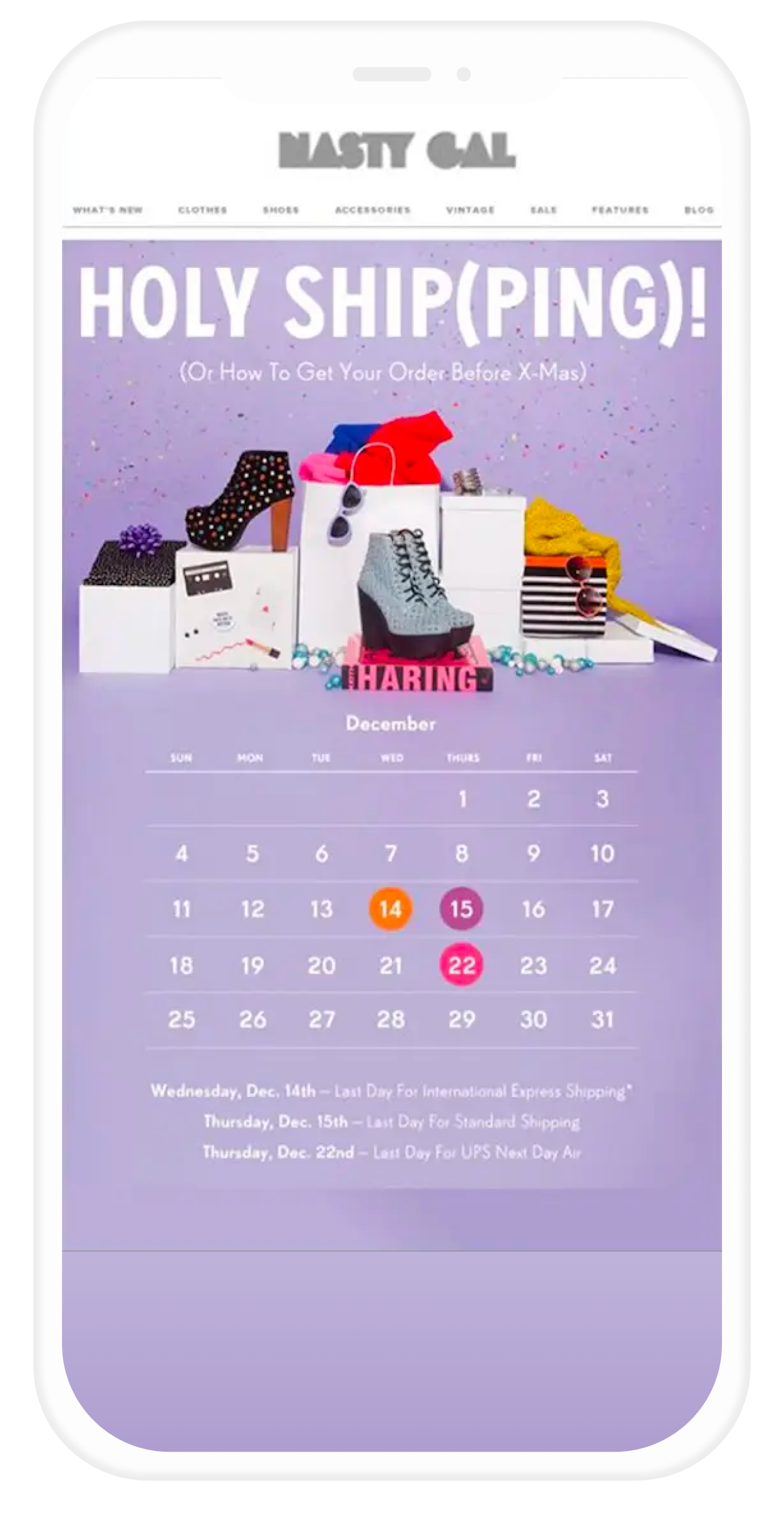
The title is a perfect example of brand voice. It’s a little touch that makes them easily recognizable and unique in an inbox packed with similar emails. Plus, clever wordplay always catches the eye. HOLY SHiP(PING) is a reference to both Christmas, and the shipping deals the brand offers.
To set the dates when shipping is last possible, Nasty Gal makes them clearly visible. Calendars are visually friendly: they are a common way of setting reminders and deadlines. By using something so familiar, you ensure that people will have no trouble remembering.
There is also a clear warning (!) to the readers: they need to remember the dates, otherwise presents will not be shipped on time for Christmas. And who wants to take the risk of not having a present ready for Christmas and upsetting loved ones?!
Key takeaways
Playing with words is always effective and entertaining. Give it a twist by tying the meaning to the time of the year, while also incorporating a touch of your own brand voice.
Use calendars and timelines to remind customers of deadlines coming up. Colors and images make it easier for your contacts to spot them and remember them.
FOREVER 21
Forever 21 is a high street fashion brand. It is the fifth largest specialty retailer in the United States. Regardless of the enormous growth and what the company has accomplished in the past 30 years, it is still a family-owned business.

Why we like it
Here are a few things we love about this email:
This email is an example of a brilliant way to promote offers. The use of virtual scratch cards creates a sense of mystery and curiosity. The unknown hidden prizes drive customers to the “Reveal your offer now” call to action (CTA). Making something personal by using possessive pronouns will always attract a great deal of attention.
Forever 21 uses a very simple layout, with strong brand consistency. Everything is clearly visible at a glance. Social media links are placed before the fold, so we don’t have to scroll down.
Make life easier for customers by including customer service links and details in your email. It is incredibly handy to have direct links to the app on the email. When browsing on the go, using an app is much more practical and efficient than using a website.
Key takeaways
Be creative! Make your email and brand stand out using inventive design and content.
Generate curiosity by not revealing everything in the email. People will visit your website to find out more.
Make it personal, speak directly to the reader.
Keep it short, clean, and tidy. This increases the probability of everything getting some attention. Long, boring emails are a big no-no.
Include customer service information. Quick links to them are always handy.
J. CREW
J.Crew is an American brand that sells clothing and accessories. It caters to all ages and styles. The belief on which the company is based is that magic is in the mix.

Why we like it
Here are a few things we love about this email:
It’s all in the title! As Halloween is coming up, J.Crew raises curiosity in the reader using a playful tone. Using an effective title can have an incredible impact
The sense of curiosity created in the title is brought to the next level when the mystery sale is introduced. The call-to-action button below will look very attractive to customers at this point.
In the very simple, black & white layout of this email, color is used to draw attention to the offers.
Key takeaways
Choose the title of your email wisely. Play around with it, but make sure your tone reflects your target audience and that you don’t lose your identity in the process.
Adding an element of mystery to your emails can drive engagement and drive people to click through to your website, to discover what your secretive offer is all about.
As mentioned before, use color to make important pieces of information stand out. If your email is going to be black and white (like this example), it doesn’t need to necessarily be bright and bold. They will stand out anyway.
Pro tip: If you’re thinking of launching a Halloween email marketing campaign like J Crew, then check out our post where we’ve outlined some of the key strategies along with a bunch of interesting examples.
TOPMAN
TOPMAN (now part of ASOS) was a British male fashion high street giant. It was the male counterpart of the TOPSHOP. As a brand, it was deeply committed to supporting emerging UK menswear design talent.

Why we like it
Here are a few things we love about this email:
No rambling, no-nonsense, no small talk. Straight to the point. TOPMAN states its delivery deals clearly at the top, using colors that make it stand out from the rest of the content of the email.
At the bottom, some of the brand’s key features are highlighted. TOPMAN offers great deals on shipping and returns, and they want to make sure that customers are aware of it by highlighting it at the top and at the bottom of the mail.
Key takeaways
Use both color and position to make things stand out: put things at the top, in bright colors, and they will get noticed.
Highlight, not only your offer but also the add-ons that differentiate you. Whether that’s amazing customer support, free shipping, or free returns, make sure your readers are aware as it could tip the balance in your favor.
OK, now you know the key dates to focus on and have seen some examples of how other companies approach it, it’s time to gear up and get your email marketing campaigns ready for the holiday season.
We’re now going to break down how to build your holiday email marketing campaigns step-by-step.
Chapter 04
Setting email goals for the holiday season
Not sure where to start? Have a look at your goals and set specific targets to identify what exactly you want to achieve with your holiday campaigns.
Setting your goals will make it easier for you to develop a targeted campaign, with a clear idea of the results you want to achieve. Goals will also make it easier to evaluate your performance once the holidays are over, by comparing the targets you set to the actual results.
Here are a few tips to help you set goals that will drive your campaign through the roof.
Start broad, get specific
Your goals determine the purpose of your campaign – what exactly you want to achieve. Therefore, it’s important to be as specific as possible when setting them. Think about what the overall aim of your campaign is: to increase your open rates? To increase your click-through or conversion rates? To promote a special holiday discount?
Once you’ve established an overall purpose, break them down into specific measurable goals, the more targeted the better. If you have precise and measurable goals, it will be much easier to structure your campaign to meet those goals and in turn evaluate your results to understand how successful it was.
For example, if your goal is to increase your click rate, set a specific percentage you’re aiming to increase it by. Other goals you can consider for your campaign could be:
Increase open rates by 15%.
30% of subscribers use your holiday discount code.
Increase traffic to a specific page by 50%.
No two campaigns are alike though, so set goals that are relevant and important to your business.
Identify key KPIs and track them closely
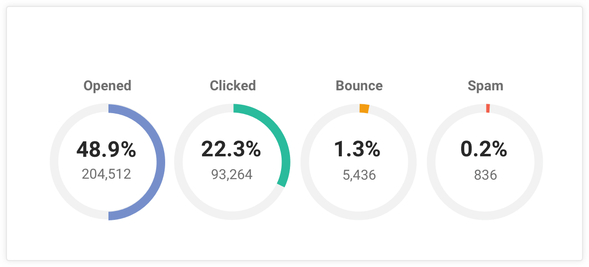
Pin down the KPIs that are important and relevant to your campaign and follow them closely.
For email marketing, the common metrics to follow are open rates, click-through rates, unsubscribe rates, and bounce rates. These should always be tracked to help you understand how well your message is getting across to your email list and how readers react to your creativity.
But for your holiday campaigns, there will probably be additional figures that go beyond the standard email marketing KPIs you want to follow. You might have a holiday sale page on your website or offer a special discount code.
In this case, your KPIs to track could be the number of visits to your holiday sale section, the number of sales from these visits, and the number of times the discount code was used for a sale.
Make sure that the results of each of your offers are measured closely so you can analyze the performance once your campaign has been concluded.
Learn from the results of your (Christmas) past
To put things into perspective and get inspiration for setting realistic and attainable goals, dive into your historical data from previous holiday campaigns. Look at how your performance developed over the months leading up to the holidays to get an idea of the kind of KPI development to expect.
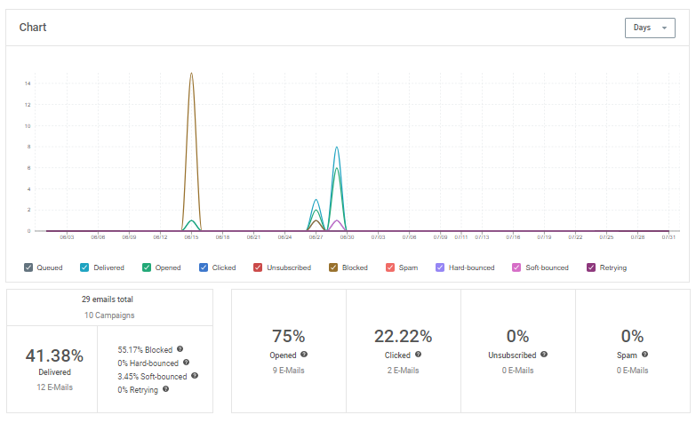
You can do this by creating benchmarks, which let you easily compare the results of former campaigns and can give you valuable input for setting new goals and understanding how the holiday season impacts your performance.
For example, our analytics tool gives you an overview of KPIs from your sent campaigns and lets you compare results and create benchmarks. Keep the data from your previous campaigns in mind and set new goals that will blow old results out of the water!
Defining your goals is key for determining the overall purpose of your campaign, identifying the KPIs to be tracked, and evaluating the outcome and learn from your results. It’s a crucial step in creating a successful email campaign, so be sure to put time and thought into the process.
Chapter 05
Crafting irresistible email content
Coming up with amazing email campaigns throughout the year can be hard, but it can be even more challenging during the holiday season. To help you prepare for this busy period, our Content Marketing team has put together some tricks to kick off your own planning process, so you can craft fresh, compelling content for your holiday email campaigns.
We will get your creative juices flowing and help you prevent burnout in this year’s content creation marathon. Start early and plan ahead to ensure you come up with email subject lines and calls to action that will make you stand out in the holiday inbox.
The principles of holiday content
The holiday season is the perfect time to boost online shopping just before the end of the year, but it is also the ideal opportunity to strengthen that special bond with your clients.
Have a look at these three key concepts to create campaigns that drive revenue, but also increase brand loyalty and advocacy:
Storytelling
Once upon a time, stories were just passed on by word-of-mouth. Now there are so many different ways to tell and spread your message: email is one of them, but you can embed and connect other media along.
The holiday season is the best time to share with your clients what your company’s all about. Wish a Merry Christmas, say thank you on Thanksgiving or just share your success stories and coolest projects of 2024.
Really powerful marketing ideas are all born from simple psychological principles. Storytelling may be a popular buzzword now, but the truth is we’re wired to like stories. And yes, brand storytelling is essentially storytelling. To stand out from the competition, you have to show your personality and win consumers over with your character.
When done right, storytelling engages your customer in the long-term, allowing them to relate to your brand’s personality and mission, and feel emotionally invested in your success. 80% of consumers want brands to tell their story but can’t remember a good example. So keep this in mind while planning your campaigns: how will you make your clients trust you and remember you this holiday season?
Voice
Maybe you never thought of your emails as something that could have a voice – let alone that this voice is something that you should give some thought to. But the way you speak to your customers through your emails matters a lot.
The best way to grow a deep, long-lasting relationship with prospects, users, and customers is to make sure that your email content fits in with the bond that you wish to create. Your brand voice is a precious tool to show how you are different from other brands – and, ideally, be immediately recognized by your customers when they open their inbox.
The holiday season brings new challenges and opportunities. While you don’t want to get so carried away that you completely lose yourself in it, the festive spirit can definitely make your brand look more approachable.
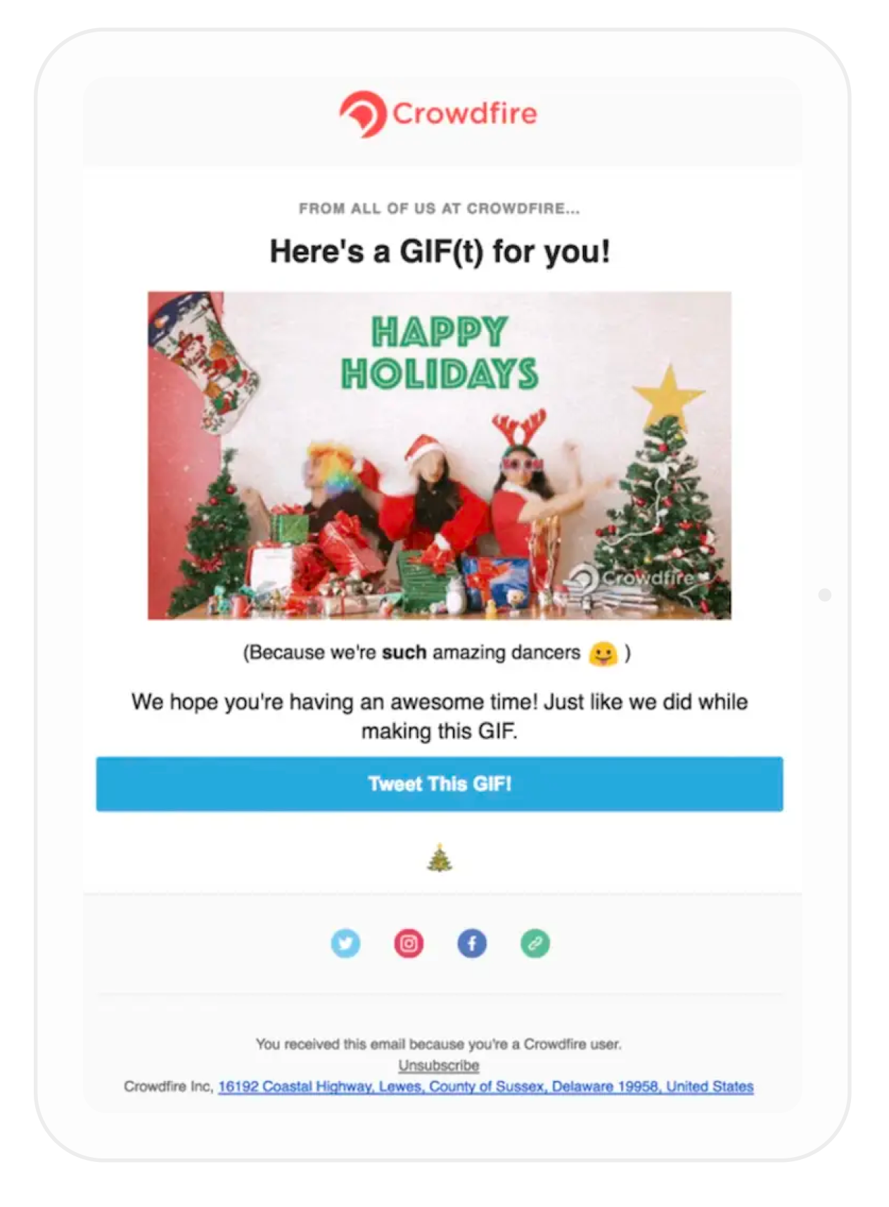
Think about how you celebrate the holidays internally, as a business, and let a little bit of that happy feeling show in your emails (through text, video, GIFs, etc.), while still having that unique voice that clients have come to recognize.
Let your customers know that you value them by sending them emails that are not focused on promoting offers or products.
Build brand advocacy and awareness by using compelling content that they can share with others. Make sure social media links are clearly visible or drive social sharing with calls to action (CTAs).
Copywriting
Nowadays, people are used to being sold to and expect companies to highlight the value of their product or service, but convincing them to do their holiday shopping on your site might be harder during the holiday season than at any other point throughout the year.
Strong copywriting will reinforce your product or service’s unique selling points while guiding the readers through the different actions you want them to take. Don’t forget about these tips when writing copy for your email campaigns, newsletters, and promotional offers:
Introduce clear and attractive CTAs: Make sure you have a clear idea about what action you want your user to take, and guide them with powerful CTAs that are both appealing and clear.
Think carefully about your email subject lines: How many amazing offers, discounts, and promotions is your contact going to receive during this holiday season? Think about how to stand out in the inbox, with subject lines that summarize the content of your email, but are also different and engaging.
Consider your tone and style: It’s the holiday season and many others will be trying to sell something to their audience. Use short and clear sentences. Make sure you sound approachable, and don’t be afraid of getting excited about the holidays – excitement is catching!
Don’t be too persuasive: Don’t be pushy. No one likes to see an email with too many "Buy Now" CTAs or to receive a never-ending automation series encouraging them to upgrade or repeat their purchase.
Chapter 06
Designing beautiful holiday emails
Like building a house, you need the proper tools to establish a strong foundation to build upon. To help you prepare for the holiday season, we asked some of our designer friends to share some advice for you to build stunning, responsive campaigns.
Visual content is at the heart of engaging, conversion-driving marketing. Did you know that 70% of all sensory receptors in the human body are concentrated in the eye? The brain processes visual information 60K times faster than it does text. Carry this toolbox with you as you hammer in each piece of your next campaign.
Choosing the right color palette
When it comes to choosing graphic colors for your holiday email campaigns, you essentially have two options:
Choose illustrations that cater to more of the traditional holiday-themed
content (Santa, a turkey, etc.) and brand them with your own colors.
Keep with your usual visual aesthetic and opt for a more subtle influence of holiday colors.
Unless you’re a design expert, your best choice is to apply holiday colors to your graphics. Colors are more impactful and make much more sense when used with the right illustrations, but you’ll want to make sure you’re maintaining a coherent graphic charter (font, identity, etc.).
“The number one rule to keep in mind is: “No more than three colors per email.” Consider it a universal rule of design, especially if you’re just starting out. Another rule to always keep in mind is that there are a limited number of color combinations, which are handily listed in the color wheel used in color theory: monochromatic, analogous, complementary, split complementary, triadic, and tetradic.”
Rachel Vanier, Content and Communications Expert
For holiday colors, try using monochromatic or complementary combinations. They are less complex than the other combinations and will maintain a consistent spirit.
Here are the color palettes we think will work best this holiday season:
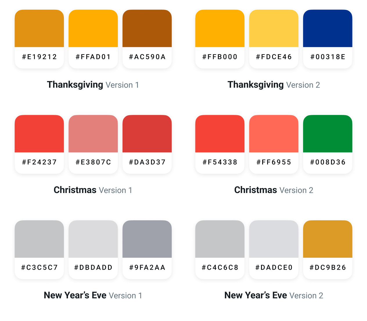
A selection of seasonal color palettes for each holiday campaign
Using photography and images
Photography is an essential part of holiday emails and getting it right is critical to grab the reader’s attention and drive action. To help you effectively utilize photos in your holiday email campaigns, we asked Nuno Silva, co-founder of online stock photography agency Stocksy United to share his advice for this busy season.
Here are his top tips:
Make an emotional connection
Your audience will relate more easily to your message if they form an emotional and personal connection when they’re reading your holiday email. Do you want them to feel excitement, anticipation, love? Keep this in mind when selecting the right photo, and take note of how the emotion in your image reflects your call to action.
Avoid clutter and confusion
Stay on message! Avoid distracting your audience with too many photos. One effective headline image is often enough to draw your audience to the call to action. Too many and you may lose them on the way.
Look toward your message
If you want your audience to find the brand or call to action right away, avoid photos where the model is looking directly into the camera. Our eyes are instinctively drawn to someone else’s. Use this to your advantage by selecting photos where the model is looking in the direction of your primary message, CTA, or logo.
Go for the unique
Pick non-traditional or unique holiday images to capture your audience’s attention. Keep in mind your audience is likely getting a lot of email at this time of year. Set yourself apart from other holiday emails with images that aren’t the usual snowman, dreidel, or Santa.
Finding the right balance between content and design
Let’s be clear: The design of your email must work with the content to provide logical continuity. It should enable the reader to understand the purpose or the information the content provides, but also build confidence.
“The design should work well with the content without taking over, and it should also
transport the user into the brand universe
. Brand visuals and brand voice should work together to showcase the brand and how it’s positioned. Design and content are one when it comes to defining brand identity.”
Aline Tola, UI designer at Sinch
At Sinch, we use Asana to submit and track our design requests. While we’re huge on design and love exploring different aesthetics and user experiences, we know that ultimately providing value is key. Each new project, content piece or campaign is built with content first in mind. Here’s what our process looks like:
Every project begins with a brief and the first step is to understand it. That’s why it’s key to have a conversation with the content creators or project leads, to ensure we’re all on the same page.
The content creators write up a draft of the copy and send it off to the designers.
The designers work on the draft, not just addressing the points raised by the content creators, but also adding a little extra touch to take the project a step further.
Designers and content creators collaborate to find the right balance between content and design for the best user experience.
The project is approved and the production process begins, be it print, online or design integration.

Sinch Mailjet’s drag-and-drop Email Editor
Making transactional emails more festive
During the holiday time, you can use transactional emails to your advantage to remind customers of ongoing holiday promos, discounts, and special offers without getting lost in the holiday email marketing whirl.
Here are our top email marketing tips to holiday-ify your transactional emails and make the most of seasonality.
Sprinkle in seasonal content
The main content of your transactional email should always speak to the reason the email is being sent. However, that’s not to say you can’t use the rest of the space to your advantage.
Here are some key ideas to do just that:
Utilize white space: Keep the subject line and the opening portion of the email focused on why it’s being sent. Then, use extra white space and margins to link to holiday promos and seasonal landing pages. Use clever copy to seamlessly tie the promo into the rest of the email.
Add a call to action: Your primary call to action (CTA) should always stay the same. However, during the holiday season consider adding a secondary CTA to direct users where you’d like them to go. Consider also linking to a product page showcasing the best gift ideas from your site or adding a newsletter signup as the secondary CTA so they can stay in the loop on all your holiday promos.
Keep it succinct: Be cautious of how much content you’re adding. You don’t want to come off as spammy or lose the reader’s attention. A way to remedy this is to make sure your primary CTA remains crystal clear and use design elements like arrows or boxes to draw attention to the main content of the email.
Adapt your design to the season
You’ve already got a great transactional email design, but that’s not to say you can’t make it festive for the winter.
Check out these few simple tricks to make your transactional emails look just as perky as the rest of your holiday marketing emails:
Spruce up colors: There’s no denying the impact of color psychology. Switching your transactional email color scheme up to a holiday color palette is one of the best (and easiest) ways to boost your transactional email design for the holidays.
Consider a neutral color palette like dark purple and blue to evoke the holiday season without focusing on a singular denomination.
Ornament your logo: A festive logo design can be used across all your marketing assets throughout the winter season, including marketing emails, social media pages, and web landing pages.
But only make small tweaks so that you don’t stray too far from your original logo design. If your logo is a wordmark, you can add iconographic elements that evoke the winter such as snowflakes or a dusting of snow. Or, if your logo is a complicated combination mark, you can keep it simple and switch up the color scheme.
Keep it on-brand: Even during the holidays, any and all communications that come from your brand should look and feel like your brand. To keep it constant, keep fonts to your brand typekit, and include your logo in the header or footer.
Picking the right tools
We’ve rounded up a handful of our favorite design tools that make it easy to create eye-catching graphics. So, when your designer goes on holiday vacation or could use an extra hand, you’ll be able to put an email together, no matter your experience level.
Check out these great email design tools and pop these graphics into Sinch Mailjet’s Email Editor to create a responsive template that looks great on desktop and mobile devices:
Canva
Design Seeds
Unsplash
Image Color Picker
GIPHY
Email on Acid
Alternatively, you can pick one of Sinch Mailjet’s pre-designed holiday email templates and customize them to match your brand.
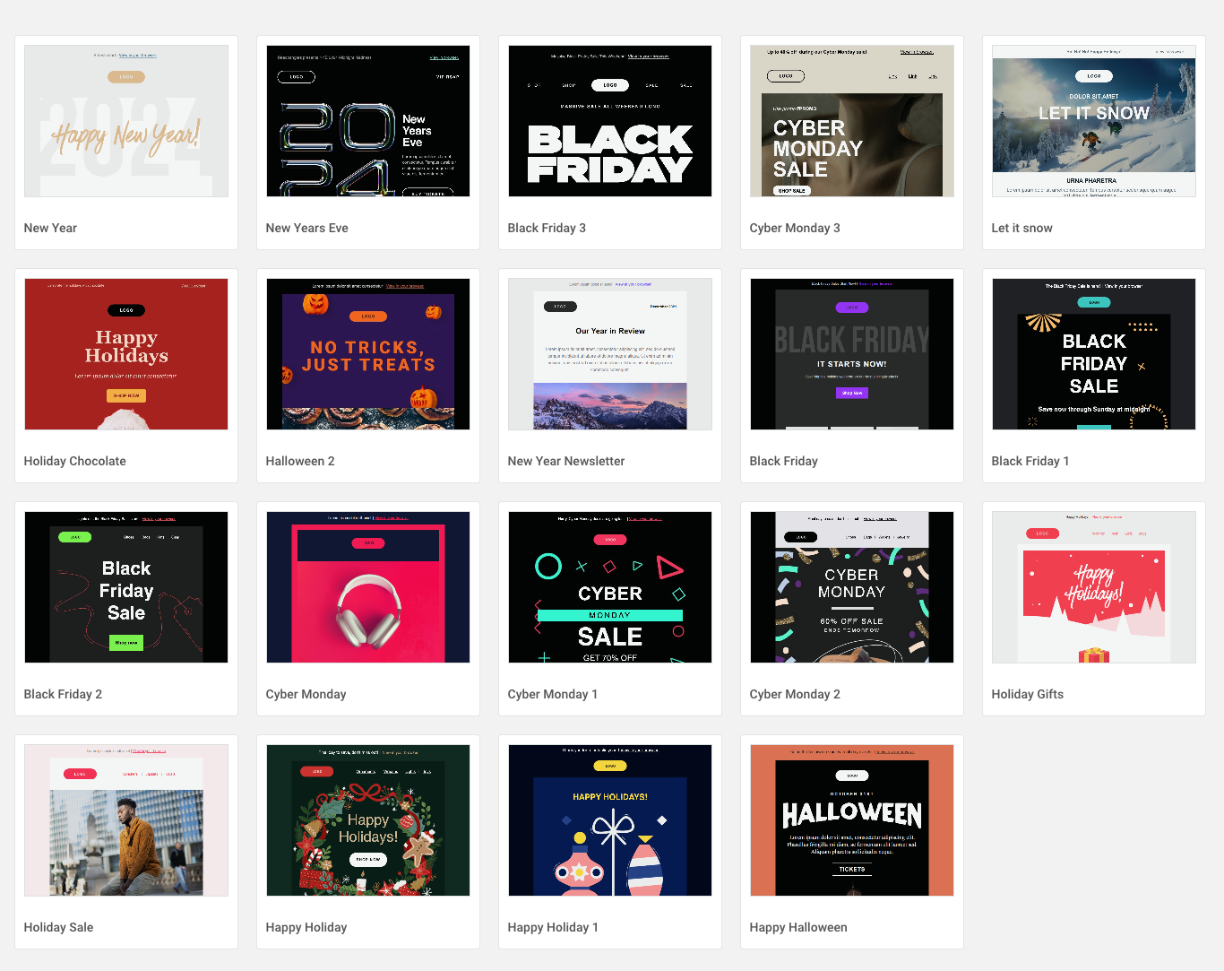
Holiday email template from Sinch Mailjet’s Email Editor
Testing the final product
As our friends at Sinch Email on Acid always say, the final step to a winning campaign is to give everything a once-through before hitting that send button.
“With half of email marketing mistakes going undetected, it’s critical to set up a rigorous quality assurance process to catch those common errors that happen to everyone, especially with such high-volume sends during the holidays.”
Kayla Voigt, Writer and Content Marketing Expert
Email marketers face a series of challenges when it comes to delivering great emails. These are just a few of the most common email marketing mistakes.
Rendering issues
The key thing to remember when it comes to testing: Your subscribers may be opening in completely different email clients than the ones you use. What looks fine in Apple Mail may look completely broken in Gmail or Outlook.
Know where your subscribers open so you can optimize effectively for common rendering issues.
Broken images
Are your images displaying properly? Even if you’re using a template, you might accidentally include an old or outdated image.
In addition, images are blocked automatically for many subscribers by default, so make sure you’re including alt text on every image for maximum accessibility.
Broken or incorrect links
Broken, incorrect, or untracked links represent a missed conversion opportunity, especially during the holidays.
Test every link to make sure you’re not sending your subscribers to a 404 page and make sure you’re tracking them so you can measure your email marketing success.
Broken dynamic or personalized content
No one wants to receive an email that says, “Hi, [First Name!]”. So, it’s important to test your emails to ensure that your ESP’s merge/personalization tags are pulling in the correct information.
In addition, ensure that fallbacks are present for instances where you lack subscriber data.
Spelling, grammar, and typos
Despite every marketer wishing it were true, there is no undo button after the send when it comes to email.
Sending typos or incorrect grammar can hinder your overall message and make it difficult for your subscribers to understand what action you want them to take. The slip of your finger on a key could cause a simple, easily avoidable error, so always spell check!
Chapter 07
More holiday email marketing ideas and resources
Still looking for more? We’ve put together some more tips and ideas for your holiday email campaigns for Halloween, Black Friday, Cyber Monday, Thanksgiving, Christmas, and New Year’s.
Check them out in our posts below:
Halloween email marketing campaigns: Tips, ideas & inspiration
Create eye-catching Halloween email subject lines: Tips & examples
Killer email marketing tips for ecommerce to increase online holiday sales
Chapter 08
Wrapping up
The holiday season is just around the corner, and there’s more to do than just dust off our Christmas jumpers and light up the whole neighborhood with festive decorations.
Get ready to plan, design, and send great holiday email marketing campaigns with Sinch Mailjet, and finish the year on a high note!


