Improve Your Email Design
Adapt display on all devices with email responsive design
No result
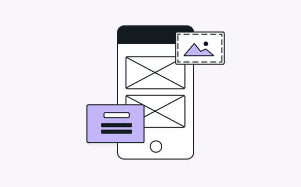
Nowadays, more web traffic continues to move to mobile. 59% of emails sent today are opened on mobile devices, and only 15% are opened on a desktop. Designing email campaigns for different-sized screens is essential for marketers in order to make the user experience as easy and intuitive as possible. This is where responsive design comes in.

Responsive email designs are about providing content that is customized for your user’s chosen device (mobile phone, tablet or desktop). With responsive design, you can send email templates that change depending on what screen size they are viewed. These emails will always render correctly regardless of the device they’re viewed on.
While the device screen size is the main factor that affects how a subscriber views an email marketing message, email clients should also be taken into consideration. The email client is the program that allows users to send and receive emails and manage an email account effectively (Gmail, Outlook…). Identify the top email clients on your market and prioritize adapting your emails for mobile to be read in these clients.
How to design a responsive email newsletter
Use a responsive email editor so you don’t have to worry about things like media queries or CSS. The email builder will take care of those for you. However, there are other things that might interfere with the end result, which you should keep in mind:
Opt for a single-column layout. This will ensure that web browsers and email clients display the content of your email in the right proportions, and you won’t have to re-adapt the design to smaller screen sizes.
In terms of images, choose an appropriate image size (no outsized or undersized images) to make sure your images display properly and adapt to any device. Also, always add an alt-text (alternative text) in case images don’t display.
Make sure your call-to-action (CTA) buttons are clearly visible and big enough so everyone can click on them easily. If you have multiple links or CTAs, space them sufficiently apart from each other.
Hierarchize and prioritize content so your emails can be easily read, even on small screens. And opt for a standard font available on any device, like Arial, Georgia, Times New Roman or Verdana.
Result
80% of people would delete an email that doesn’t display properly on their mobile device. Design responsive emails to offer a good user experience and improve your conversion rate.
Previous tactic
Work faster with email collaboration
Next tactic
Add images to your emails
Difficulty
Intermediate
Pro Tip
A perfectly displayed email can mean much higher engagement. Use an Inbox Preview tool to avoid manual testing and save time by previewing the email you want on the email client and device you want.
You might also like

Build your emails with a drag-and-drop email builder
Learn more

Make email tests before sending
Learn more

Insert effective calls-to-action in emails
Learn more