Email best practices
Strategies to optimize ecommerce email marketing campaigns
If you’re looking to grow your target audience, put some effort into email marketing design. We’ll show you how to maximize sales and growth with excellent email design.
PUBLISHED ON
Professional email marketers know that most people spend about 15 seconds reading an email. That’s why you have to level up your email marketing by performing A/B tests, learning about automation, email copy, and design to make your emails worth your readers’ time.
Email is 40 times more effective at customer acquisition than other mediums like social media. Plus, well-executed email marketing content can drive conversions, like moving people along the customer journey toward completing some desired action.
Table of content
1. Subject lines
2. Preheader
3. Logo and color
4. Images
5. Text
6. Call-to-action (CTA)
7. Footer
1. Google store
2. Chipotle
3. Dollar Shave Club
4. MasterClass
5. Ellesse
What makes a good ecommerce email marketing design?
All right, so you’re sold on the idea that ecommerce email marketing design and email templates will do wonders for increasing your email list subscriber count. We completely understand if you’re feeling trepidation about where to start without bungling the entire operation.
So let’s get into how to produce email marketing campaigns with designs that complement your brand image, communication, and voice.
1. Subject lines
What’s the first thing you notice in an email? Say it with us now: the subject line. Every good email has one. And while there isn’t technically any design language related to the subject line, they’re a crucial component of making an email clickable.
Subject lines act as the first impression of your email. So a quick subject line scan should tell them everything they need to know about the content of your email. It should entice them enough to make them want to open it.
Almost half of all emails are opened on mobile devices, so make sure that the subject line works across differently sized screens, including Apple iPhones and iPads, Android, and Google devices. Designs with four to seven words are proven to work well and show up on small phone screens.
2. Preheader
This is a rundown following the subject line that summarizes the email. It’s kind of like the email’s abstract.
Email clients will show your email audience your preheader on both mobile and desktop, the idea being that readers can get a better sense of the subject matter of your email before they open it.
The preheader and subject line work in tandem to generate intrigue. Combined, they encourage recipients to open and read your content. The idea of preheaders might sound redundant, but omitting one is a missed opportunity. They’re your chance to include any introductory text you think might get people opening your emails. We’re talking exclusive offers, promotional content, exciting updates, and more.
Write the most important information first. You want to cater to people who don’t have much time on their hands. Plus, leading with the most important content will help your messaging get across even if some gets cut off by the recipient’s screen.
3. Logo and color
Let’s get down to brass tax and accept that the human race isn’t as sophisticated as we pretend to be. Sure we invent new technologies and have philosophers and language, but at the end of the day, we’re attracted to things that look pretty. We love bright colors arranged in a complementary fashion in an aesthetic that appeals to our subconscious. That’s why certain flowers evolved to have bright colors – so insects and other animals would be attracted to them.
Email marketing design is no different.
The logo and colors you choose to use for your design make a difference. End of story. We encourage you to use tools like a color wheel or consult a specialist to choose a color palette that aligns with the vibe you want to convey to your recipients.
It’s not rocket science. A nice pop of color helps your emails stand out and might make all the difference in boosting your click-through rates (CTR) and other KPIs like open rates or how many people end up on landing pages.
4. Images
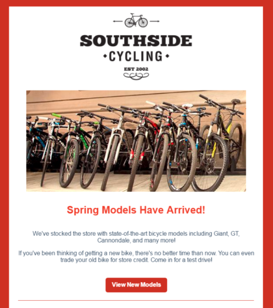
You know the old expression, “A picture is worth a thousand words.” No one wants to read a thousand words when they open an email, so imagery works in your favor. Big time.
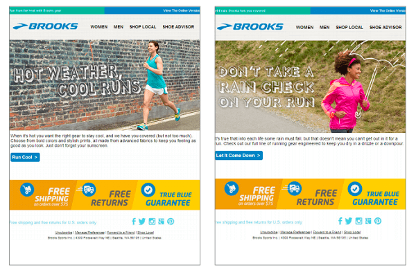
Consider the examples from sports equipment company Brooks. These ads represent what a customer might see depending on where they live. For example, they might send the image on the left as a targeted ad to an individual who lives in a hot climate, and a person living in a cold environment will receive the one on the right.
In both cases, Brooks’s athletic wear can be used in different environments, which further helps email recipients imagine themselves wearing the garments. Thanks to these images, an audience member might spend more time considering Brooks’ products, and they might be just the nudge they need to make a purchase.
Remember, white space is your friend and don’t overload your email with pictures that confuse and deter your potential customers.
5. Text
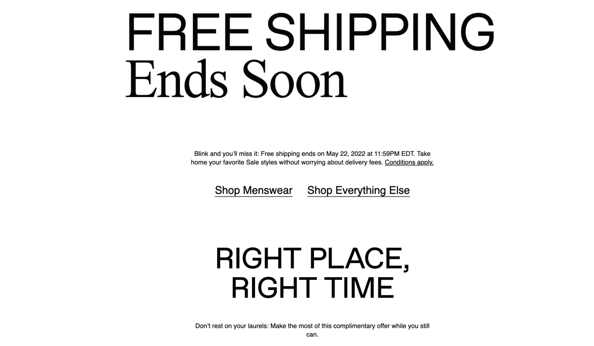
We said it’s not all about the text in your emails, and we stand by that statement. But the truth is, while other elements matter, they all need to collaborate for effective marketing designs for follow-up emails, email newsletters, and other email campaigns.
As we’ve already discussed, most email recipients are scanning your email. We mean that your audience likely glances at the first few words they see at the top and decide whether they want to continue.
By writing fantastic copy, you will draw that scanner in and convert them into people who read your emails. So think about ways to design all your text to catch and hold attention. Play around with the font size, and consider flattering colors that work with your brand’s image and voice.
6. Call-to-action (CTA)
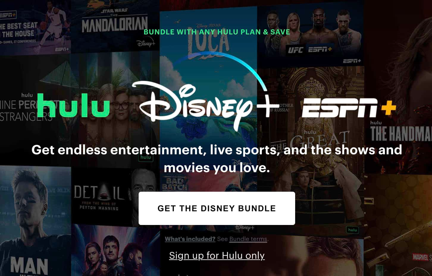
So you’ve held your readers’ attention, and they’re browsing your email marketing content without putting it in their spam folder. Now once they’re reading, you need to ensure they know what to do next.
Don’t forget to include a call-to-action (CTA) button that attracts attention. Make sure it’s featured prominently in a minimum 14pt font. We encourage you to send content that includes between three and five sentences about why people should click on your CTA button.
7. Footer
We’ve arrived at the bottom of the email. That confounding conclusion can be so hard to nail just right. If you’re ever in doubt, always remember that the footer of your emails should act as an email signature and be consistent across all emails. That means the layout, design, and contact information for your business should all be the same.
We suggest being forward and including links to your other content like your website, social media accounts, etc. You should also ensure your business address and contact information are updated and included in your email footer section. A reader should know exactly how to get in touch with you.
There’s nothing worse than putting your digital foot in your mouth and including dead links in your email footer. Stay one step ahead of the game and test those links before you start sending out content to your email list subscribers.
5 great examples of ecommerce email marketing design
Now that we’ve reviewed elements that come together to make excellent email marketing designs, let's go over some examples of businesses that have put these tips into action.
1. Google store
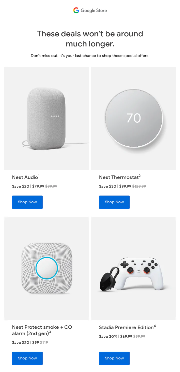
This might be the best example of minimalist design cranked up to the maximum. Just look at Google’s sleek positioning of all the text elements and imagery. An email recipient is getting a feast for their eyes with glossy imagery and a CTA that’s gently beckoning to be clicked. Plus, the value in this offer email is clear and direct.
2. Chipotle
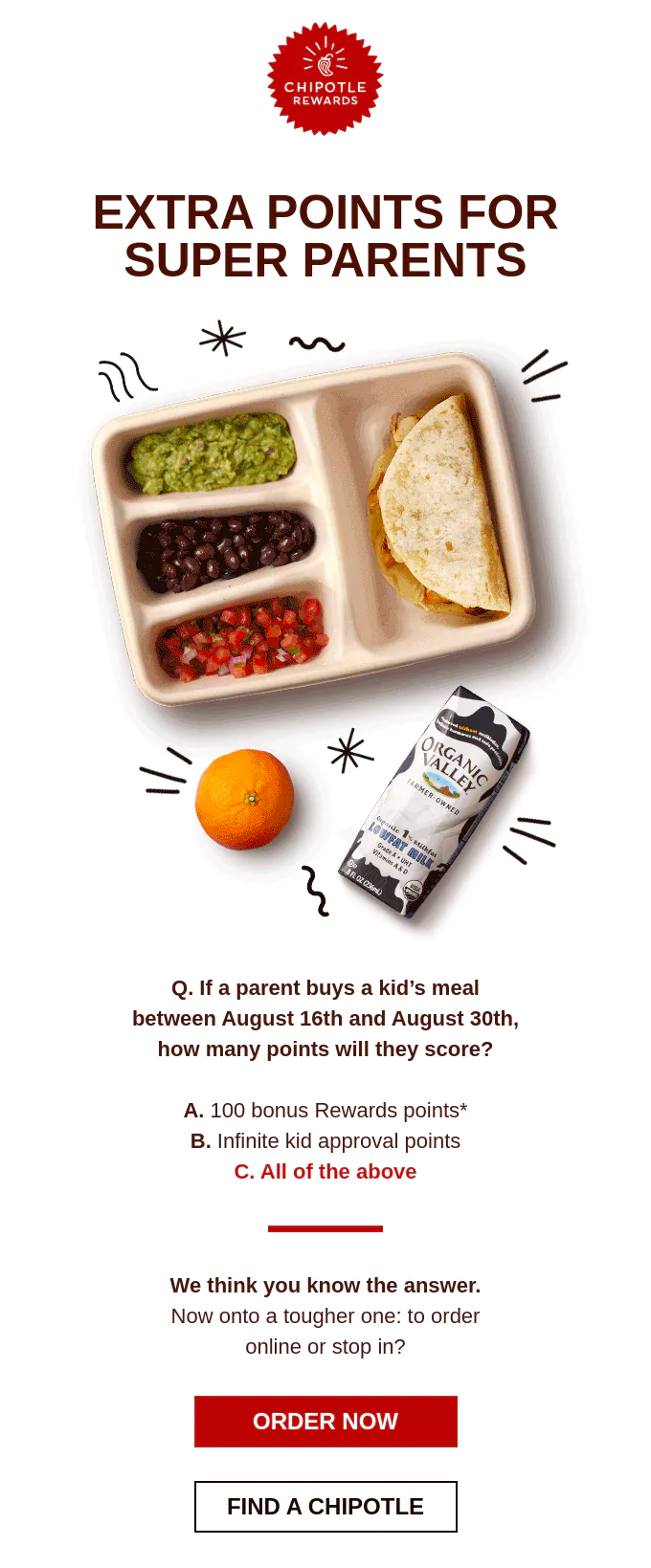
Does this email incentivize parents to buy Chipotle to provide their kids with healthy and delicious meals when they’re ready to go back to school? Silly question – of course it does.
This email also gets points in our book for incentivizing parents further through earning points with a customer loyalty program. This email is the definition of succinct, and that’s why it’s an example of ecommerce email marketing design done right.
3. Dollar Shave Club
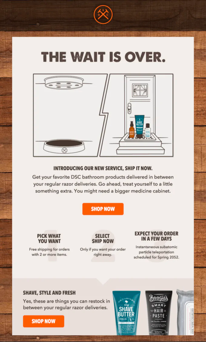
Did someone say an announcement email? Dollar shave club successfully conveys a message while projecting a consistent look and feel to its branding. The rustic design practically leaps off the screen, from the textures to the color scheme. The company’s slick campaign is poised to provide value to their customers with their grooming products delivered monthly.
4. MasterClass
Enter MasterClass, the platform where high-quality online courses are served on a platter with a side of caviar.
MasterClass doesn’t shy away from the fact that not all the classes on its platform are the most affordable. In fact, they head their recipients off at the pass by addressing it right here in their email marketing design. In this way, the brand sets expectations and builds brand loyalty while using its design language to the nines.

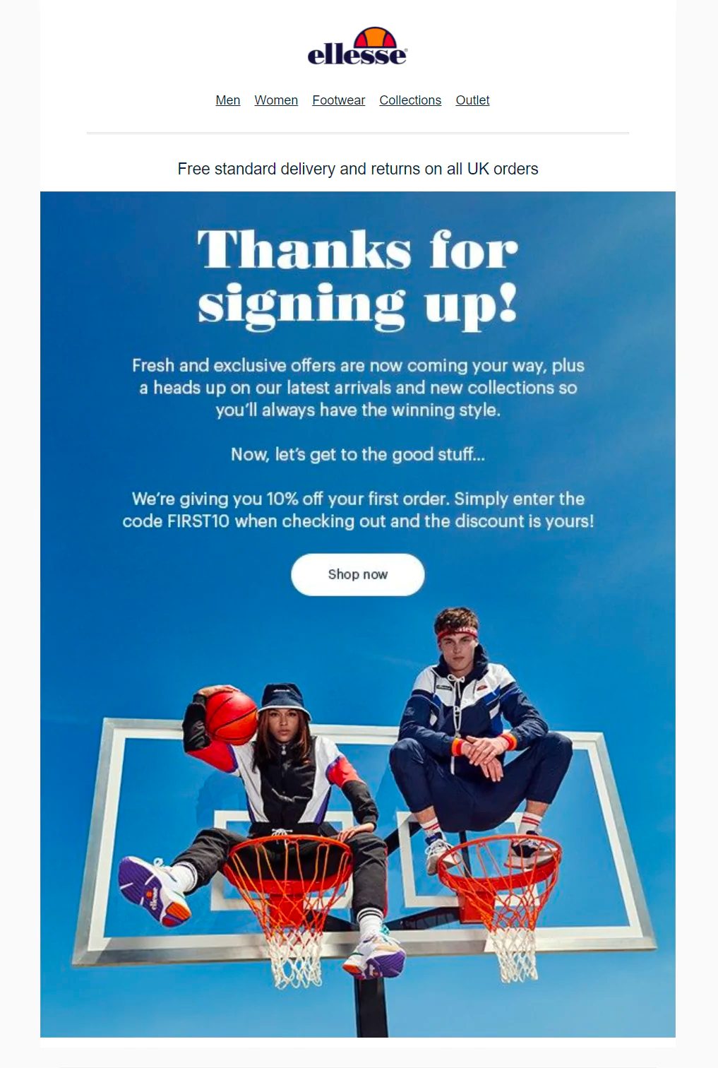
5. Ellesse
Welcome to one heck of an excellent welcome email. As you surely know, welcome emails set the tone and can create a lasting first impression between your audience and you. So take a leaf out of Ellesse’s book, and include information in your welcome email about why you’re emailing your recipients and what content they can expect to see from you in the future.
Wrapping up
Building sales figures for an ecommerce business can be a challenging task to undertake. Through email lists and inventive design, consumers will want to open the messages you send and feel a sense of urgency to interconnect with who you are as a company. Thinking outside the box will allow you to triumph over your competitors.
Related readings
Popular posts
Top email marketing trends for 2022
To the outsiders, it can sometimes feel like email hasn't changed that much since it was created. Maybe this is why some are so persistent in...
Read more
Reducing email’s carbon footprint
When it comes to protecting our planet, every step toward cleaner practices – small and big – counts. So, what if we told you that emailing, as clean and green as it seems...
Read more
Marketing calendar 2024: Dates you shouldn’t miss this year
We finally got through 2023 (phew!) and Q1 is just around the corner. It’s time for you to start scribbling down your New Year’s Resolutions to make sure we start the year with a bang. If you’ve found your way here, we’re guessing that’s because creating a winning...
Read more

